If you live in a city, you’ve probably seen your share of funny street advertisements. These signs are meant to be seen by passersby rather than as part of an ad campaign, but that doesn’t stop advertisers from getting creative. They stand out among the other ads on the street and make us want to either laugh or run away screaming.
Here are some of the funniest examples we’ve ever seen. You might think advertising is an art form, but it can also be very scientific. There are so many different factors that have to be considered when coming up with a new campaign: target audience, location, budget, and the message you want to get across all need to come together in one cogent idea.
Taco Bell’s Fresh Start
Taco Bell is no stranger to street ads. One of their most memorable campaigns used giant cauldrons of warm, bubbling green paint to make passersby want to stop and check it out. This campaign was a collaboration between Taco Bell and artist Karen Fiorino (better known as Her Bad Mother). The two were hoping to get some attention for Bell’s new “Steal the Menu” promotion, which offered creative “Bell-inspired” recipes. Fiorino’s particular creation was a giant cauldron of green goo that passersby could stir with wooden spoons. People could stir the cauldron as much as they wanted, but they couldn’t take the goo home. This paint was the same stuff that was used to paint the menu boards at participating restaurants.
KissFm: Do You Remember?

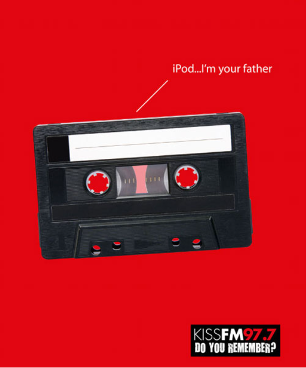
Do you remember that there is a radio or do you prefer to listen to music on your iPhone or iPod? Do you listen to the radio? Radio is not a relic of the past and is now developing in the same way. This banner was created by English Radio KissFM to emphasize that even with iPhones and iPods, the radio is still alive. This ad stands out for its humorous and smart approach. It depicts a cassette and there is an inscription “iPod…I’m your father” which has a connection with Star Wars.
Axe: Smell Good Or Die Trying
This ad from Axe is a little bit confusing, but it also makes us laugh. The brand is known for its edgy, sometimes offensive marketing campaigns. For example, one of their ads featured a woman holding a giant pair of red lips that she had just cut with a pair of scissors. This particular billboard has the words “Smell good or die trying,” with a giant axe dripping with blood underneath. Cruise down any street in your city and you’re bound to find a few funny ads, but these Axe billboards are especially entertaining.
Pringles: Hot&Spicy

Pringles is one of the most popular brands of potato chips in the world. Their advertisement is very simple but very funny and original. It advertises a new flavor of Hot & Spicy chips. Here is a picture of a guy who has just eaten new chips and is breathing into a balloon and flying like that. We can say that these chips are really hot and spicy.
Spider-Man And The Daily Bugle
We’re not sure what this ad is supposed to mean, but it’s definitely funny. This is part of a series of ads created by the New York Times. The ads are meant to mimic the front page of a newspaper, but they’re not published anywhere. They cover a range of topics, and this particular one shows Spider-Man standing on top of the Daily Bugle’s roof. He looks angry as if he’s upset with the news organization’s coverage of his career. We appreciate that the ad is topical, but it’s not clear what it has to do with the New York Times. It may not be a great example of clever advertising, but we like that it’s weird enough to make us stop and think, “What the heck is that supposed to mean?”
Gillette: More Shaves Than You Can Imagine

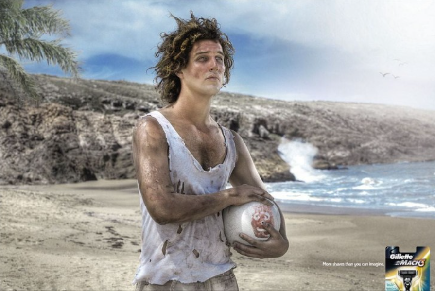
Have you seen the movie “Cast Away”? If yes, then you will definitely understand this advertisement for Gillette Mach 3 razor. It is very funny, original, and creative. The ad highlights how durable the razor is.
McDonald’s: The Real Milkshake

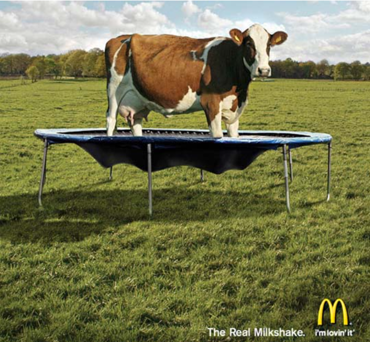
A very funny and interesting McDonald’s banner that highlights the fact that McDonald’s milkshakes are “real”. What is shown on it? A cow on a trampoline and the slogan: “The real milkshake.” After this, how can you doubt the naturalness of McDonald’s products?
Starbucks Window Banner
Starbucks is a multinational coffee chain that is well known for its unique branding and exceptional drinks. This is why the company decided to create a street banner that is designed to promote its product. This particular banner is a creative combination of visuals and typography that is made out of coffee beans. The beans are placed on the street in a way that forms the company’s logo, as well as the words “Come as you are”. This is a simple but effective example of how one can use the elements of the product to create a visual identity for the brand. The banner uses the beans to create a memorable and unique design that represents the brand.
Conclusion
Street ads can be a great way to get attention for your brand, product, or service. They’re often very cost-effective and can be put up very quickly. If you’re interested in doing a street ad campaign, make sure you check with your local government to see if there are any laws or restrictions on what you can put up. Before you go, remember that it’s all about getting creative. Don’t be afraid to try something new or get a little silly. If you can come up with something that will make people laugh, you’ve got a great chance of getting their attention.
